ASSESSMENT CRITERIA QUESTIONS
As requested by Cameron, below are my answers for the questions listed on the Assessment Criteria. These answers may change, but I think they are a good summary for where I am at / what my design aims to achieve.
Infrastructure
1.
Strategy (12.5%): Has the infrastructural strategy been developed and
communicated well in the blog and final presentation/submission?
Description:
What is your strategy for utilising an existing or newly proposed
infrastructure? How does it influence the way you design an architectural
entity and how it improves the way politicians, governmental institutions and
others offer and people access parliamentary and/or governmental services?
Answer: The design offers a place to learn, interact, communicate and celebrate. With the parliament, and with the connected nodes across Australia. The train lines (as discussed in Project 1) will be used to transport mobile "nodes" (that relate to the design of Federation Mall) to areas of significance across Australia. These will interact with the permanent design at Federation Mall, and will be used to gather information from those across Australia.
2.
Logistics (12.5%): Has the logistics been considered and well
incorporated in the design? Has the development been well documented and
communicated well in the blog and final presentation / submission?
Description:
Your design is required to respond to changing needs. Whether it is an
instantaneous, temporary or long-term change, it is needed to be a part of your
design consideration. How is your architectural entity designed to change,
move, shift, transform, adapt, interact, etc.? Where do components and/or
information stored? Where are they generated or manufactured and delivered?
Answer: The pavilion spaces will provide flexible designs to allow a variety of uses depending on the current needs. The use of digital technology devices allows for a change in use / program. However, as I feel the parliament will always be in need of a public forum and discussion, I don't see the space falling into disuse. The mobile nodes will display simple/ small almost "flatpack" designs that can easily be moved and assembled. Interaction in these nodes will be achieved through positioning in popular public areas (such as Federation Square, Melbourne; King George Square, Brisbane) and wireless device connections to the main "hub" at Federation Mall.
Tectonic Resolution
1.
Purpose and Function (12.5%): Has the purpose and function
of the architectural entity be chosen in response to (latent) needs? Is the
design response appropriate? Has the development been well documented and
communicated well in the blog and final presentation / submission?
Description:
It is imperative that your design effectively provides parliamentary and/or
governmental services in response to needs. You are to creatively investigate
the (latent) needs, and it is essential that your proposed architectural entity
provide solutions or opportunities for people to resolve issues.
Answer: The entity responds to the need of parliaments needing to achieve greater accessibility and transparency; the need for the Government to act in a hive mentality - with the people. The design provides a place for the public to learn, innovate and celebrate - a mutual learning scheme between the Government and the public.
2.
Circulation and Access (12.5%): Has the use of architectural
entity been studied and the circulation within and/or access to it been
studied? Is it evident in the design? Has the development been well documented
and communicated well in the blog and final presentation / submission?
Description:
No matter what you design, it will fail if people are not given appropriate
access to, within and/or between your proposed spaces. It is very important that
you provide enough evidence in your development stages and final outcome that
your architectural entity has good circulation and access.
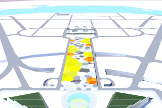
Answer: The re-design of Federation Mall responds to the current lack of circulation and mobility through the site. A new circulation path will be proposed, which will in turn extend the use and accessibility of the site.
3.
Structural and/or Operational Integrity (12.5%): Has the structural
and/or operational integrity been studied and made evident in design? Has the
development been well documented and communicated well in the blog and final
presentation / submission?
Description: How believable is your
proposition? It is very important that the proposal demonstrates your design
decisions are informed by clear understanding of physical and practical
limitations. You are required to demonstrate structural integrity of your
design proposal, and/or in some cases, operational integrity to show how the
distributed or virtual artefacts work as an architectural entity.
Answer: The Federation Mall design in itself will be quite structurally stable and permanent - it will be seen as quite a grounded design, integrated into the landscape. I aim to produce assembly documentation for the mobile nodes, showing how they work and fit together when in the areas of significance across Australia.
Poetic Resolution
1.
Presence and Identity (12.5%): Has the impact of the
proposed entity's presence been considered and its identity been chosen with
strong understanding of what it needs to represent and signify?
Description:
It is vital that the presence of your proposed entity is appropriate for the
context and signifies the services it offers. It therefore is very important to
give specific consideration to how people identify and recognise your proposed
architectural entity as a whole and/or a part.
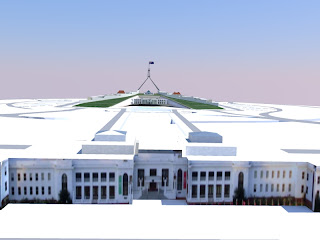
Answer: The Federation Mall design will be associated with Parliament due to its locations; the design will signify a place to interact with Parliament - a public meeting space between the two major parliamentary buildings. I am using the hive concept developed in Project 1 to create a certain aesthetic and understanding of the interconnectedness. The Nodes across Australia will be designed similar to the permanent pavilion designs located at Federation Mall, providing a visual link and understanding of their purpose - the link they have with the Government and Parliament.
2.
User Experience (12.5%): Has the experience of users been considered and
effectively presented from the perspectives of users?
Description: It is
imperative that you made your design decisions based on the requirements of
people who will experience and use (a part of) the proposed entity. You need to
demonstrate not only generic appearances of spaces with people, but also
construct scenarios to orchestrate how specific people in specific need
experiences and utilise services offered by the proposed entity or parts.
Answer: The space will be used for learning, innovation, resources, communication and celebration. The pavilions and spaces in between will be designed to facilitate these experiences and uses. Ie. the public space will provide appropriate designs for gathering, relaxing, protesting, celebrating... whilst the innovation spaces will provide flexible workshop spaces, or gallery style spaces.
3.
Aesthetic Rigor (12.5%): Has the effort been made to pay attention to
detail in your communication?
Description: This criterion is to reward
your attitude towards preparing successful architectural communication. As
architects, you will spend majority of time communicating ideas to your peers,
bosses, clients, engineers, contractors and/or other stakeholders. What and how
you prepare and present directly influence how others evaluate the credibility
of your claim. Your commitment towards visual communication during development
stages (through blog entries), final presentation and in your final submission
is to be assessed.
Answer: I have already begun to create my 3D model, so I will be using renders, etc. from this to convey my ideas. I may possibly create a 3d animation of the site design, depending on time constraints. I definitely want to try and make a physical model of my design. I want the presentation to show the Federation Mall design, as well as the node design - how they travel, are assembled and them in use in other cities. I'm not entirely sure at the moment how I am going t physically present - either panels, or a powerpoint type presentation - probably the latter due to panel printing costs.
Summary: I feel that the concept behind my idea is there, and I have a clear idea of what I want the space to achieve, it's now just the actual design part I need to start working on. I want the focus of my design to be the Federation Mall design, with the nodes as an 'added extra' - conveying how the Mall can link to the rest of Australia. These nodes will be inspired from the mall design; the pavilions in the mall design will be permanent and not mobile. I'm not sure how keen you were on this node design aspect last week; but I feel with the theme of Distributed, and the way our Project 1 developed, this connection to other parts of Australia like a hive is quite crucial. It also strengthens the aspects of Structural/Operational Integrity and Presence and Identity.
Please leave comments with feedback! :)


